“Affordances” in the discipline of user-centered design are the things about a product that make their usability “easy” or “intuitive.”
I’ve noted 2 things on this riverboat whose affordances do not advance their usability:
- The icons on the water machine, and
- The handles on the doors into the lounge and bar.
Water machine
Its affordances: The two icons that indicate sparkling water (on the left side) and still water (on the right side).
I watched person after person put their glass under the right icon when they wanted still water and under the left icon when they wanted sparkling water, which is the intuitive thing to do.
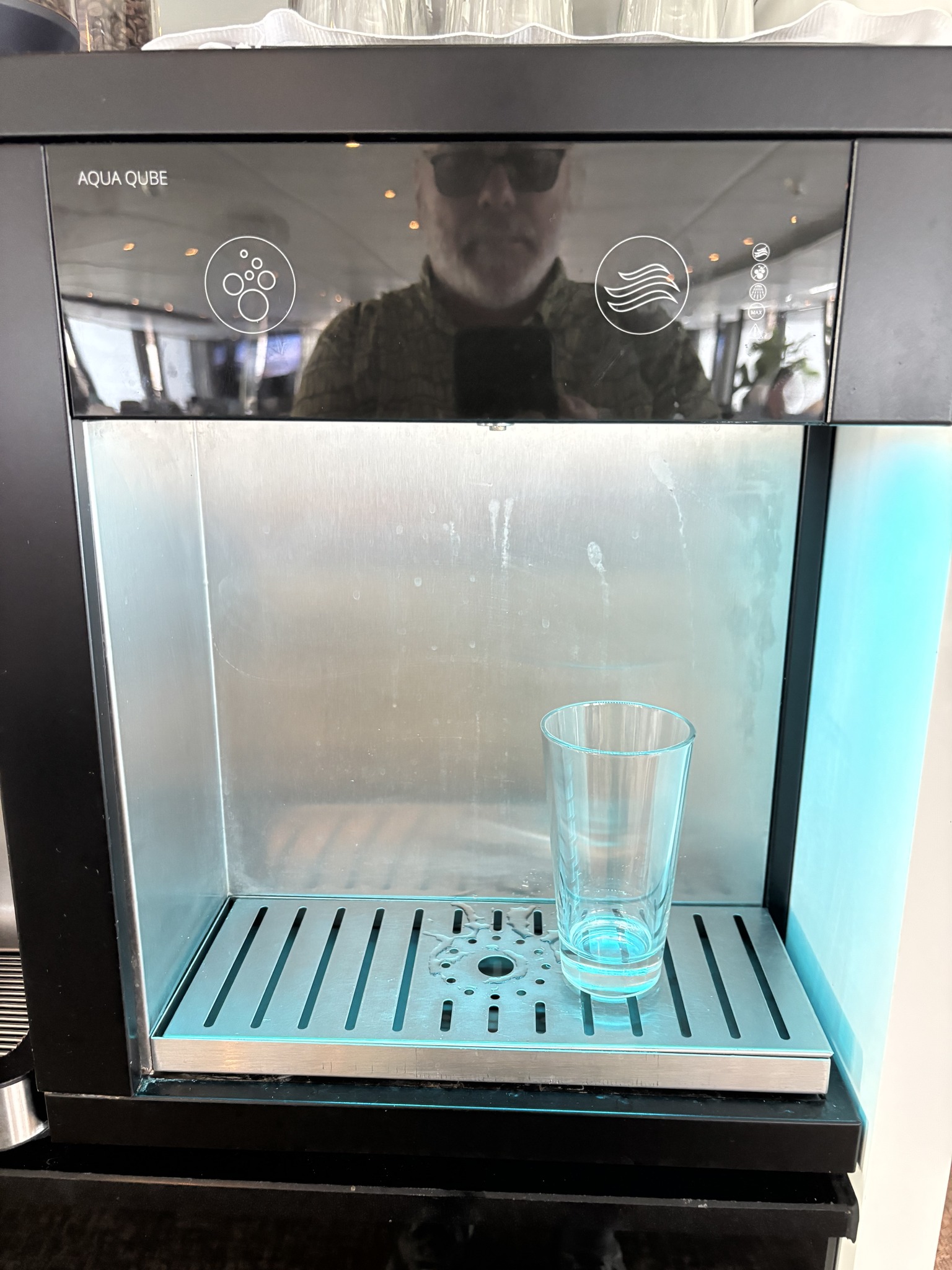
The problem is that both the sparkling and the still water are dispensed in the middle of the machine, so you need to put your glass there regardless of which kind of water you want.
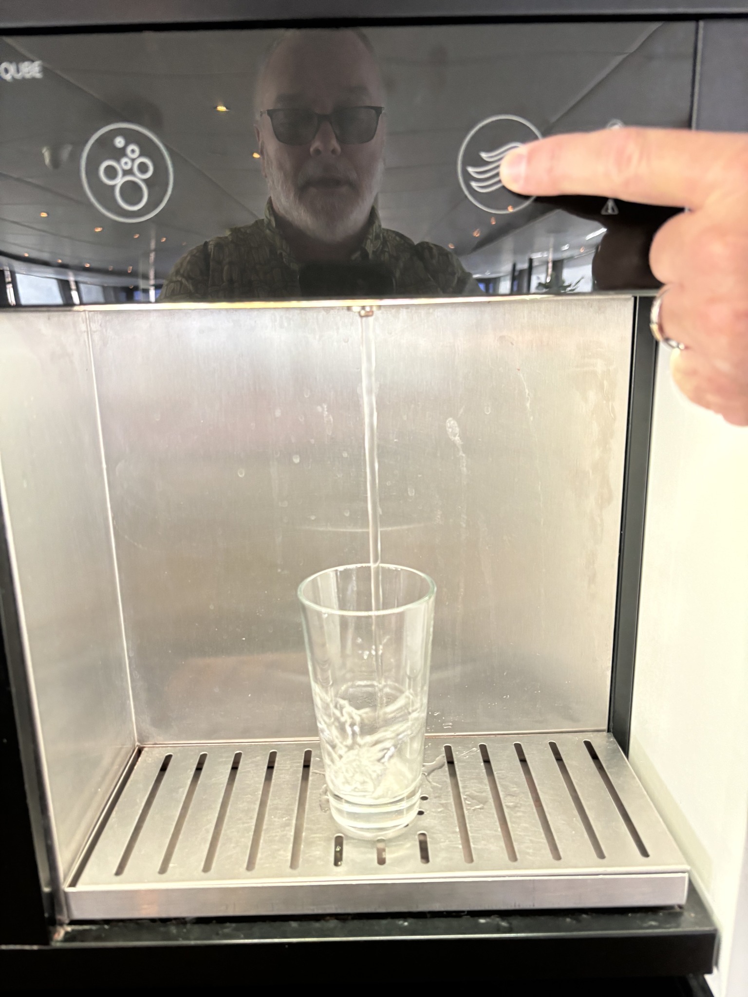
A better affordance would be if those two icons were stacked (like a stoplight) in the middle of the machine above where the water actually comes out, which would make it intuitive to always put your glass there.
Door
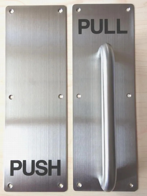
Its affordances: The handles on these doors are the same on both sides, and they are the type of handles that one intuitively pulls.
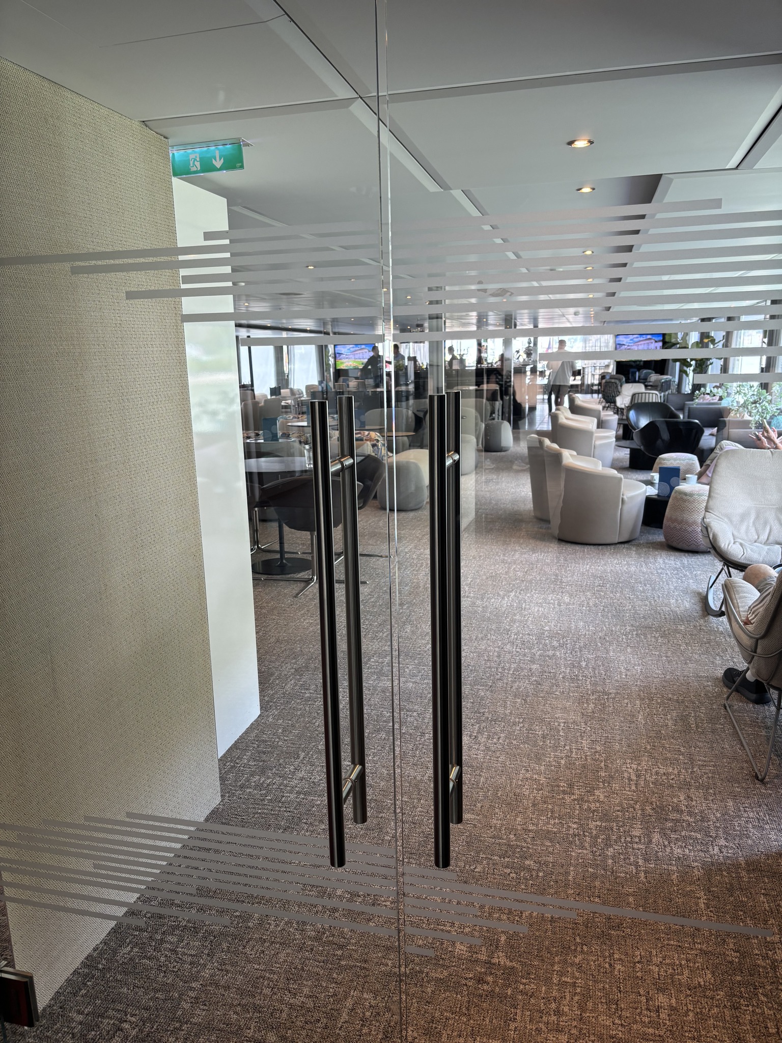
The problem is that you need to push the door to enter the lounge, and you need to pull the door to exit the lounge.
Better affordances would be to have standard handles that people intuitively know how to use — so a flat handle on the side you push to enter and a handle like that one that’s already on them on the side you pull to exit.
Rant over.